Evolve. Talent Ecosystem.
Evolve was no longer just a tech school. The company was evolving into a platform connecting talent, education and companies through a scalable digital ecosystem designed to bridge the gap between learning and employability.
Client
Evolve
Context
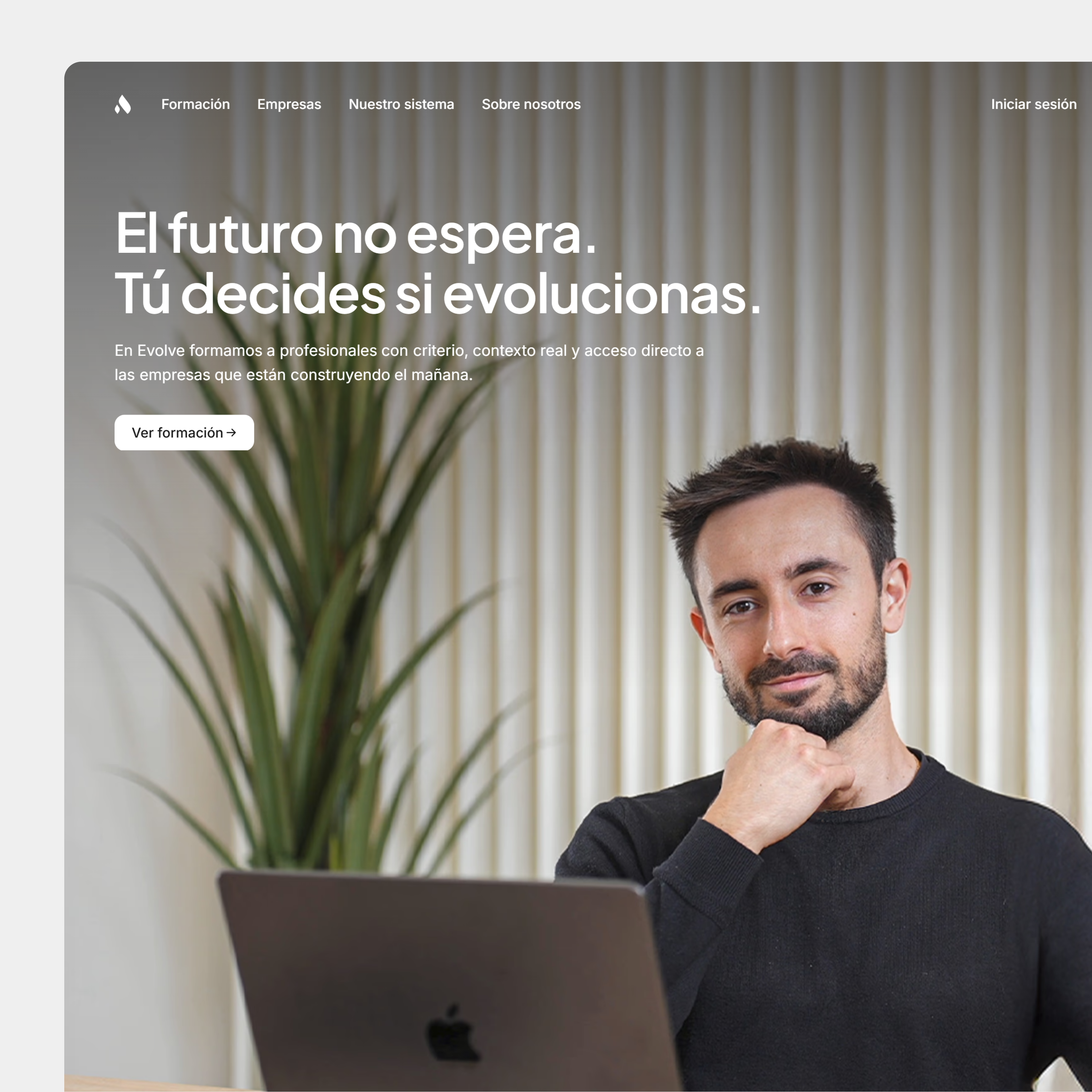
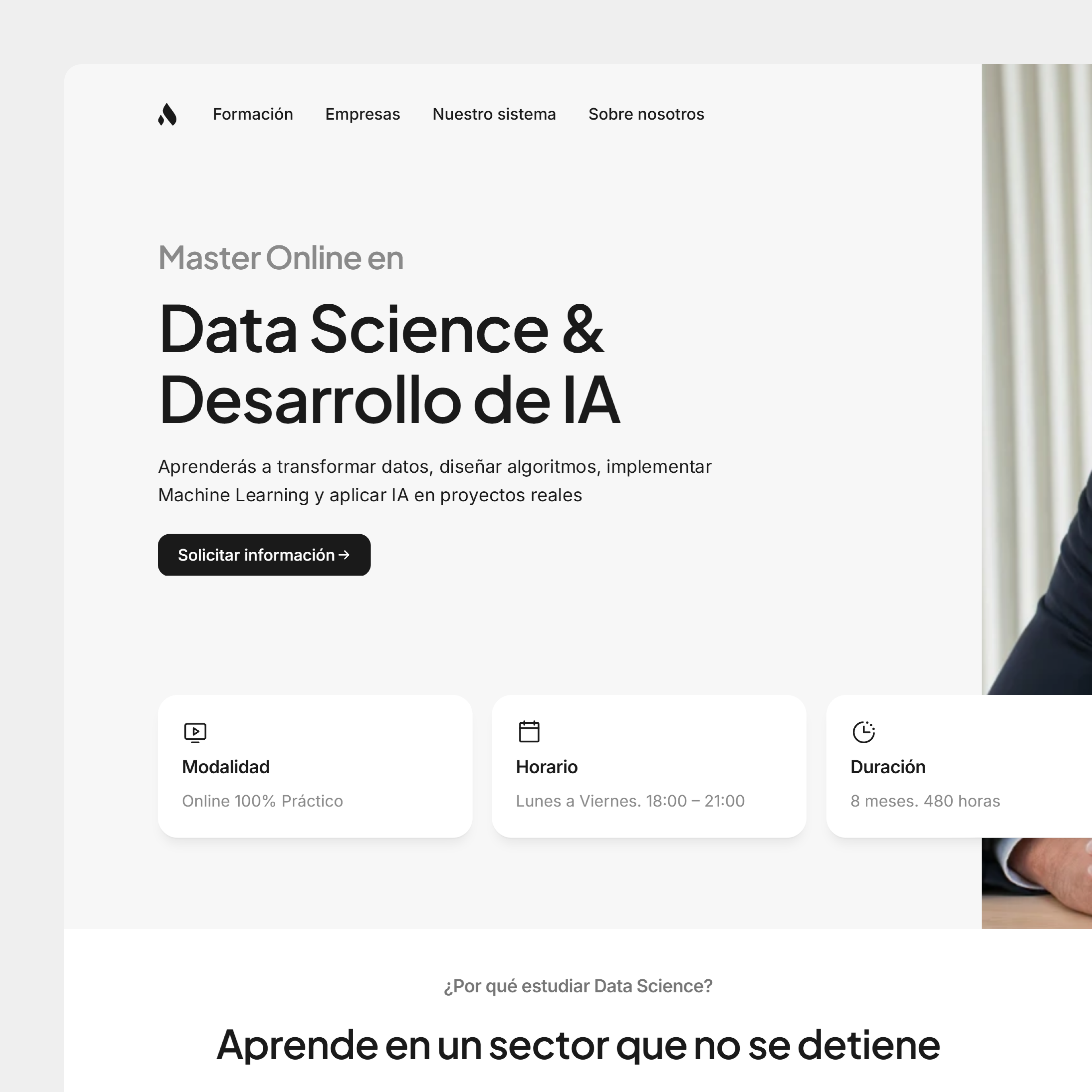
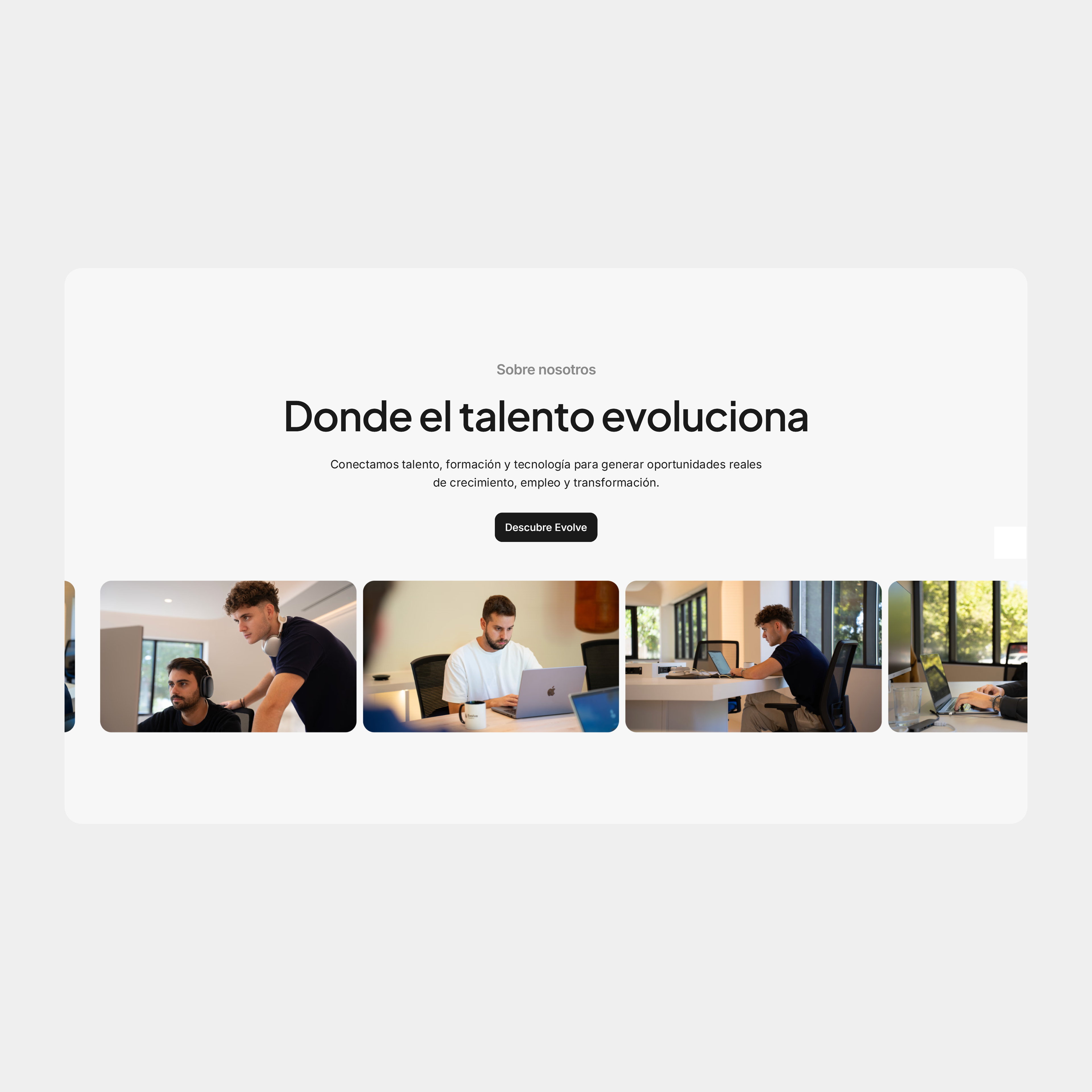
Evolve started as a technology education platform focused on helping students enter the tech industry. But over time, the company’s vision expanded far beyond education.
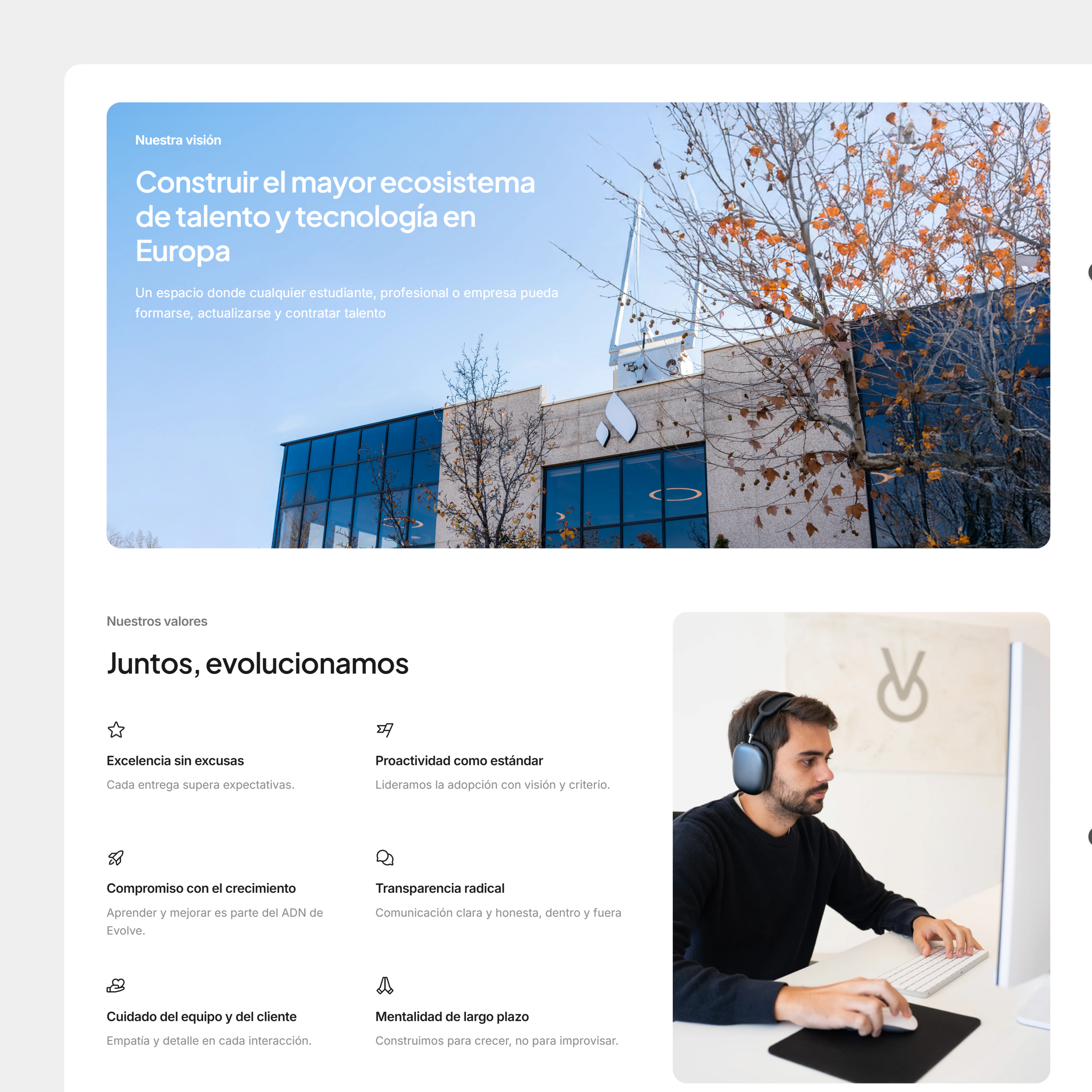
The new direction was to build an ecosystem where talent, companies and training could coexist in a single platform.
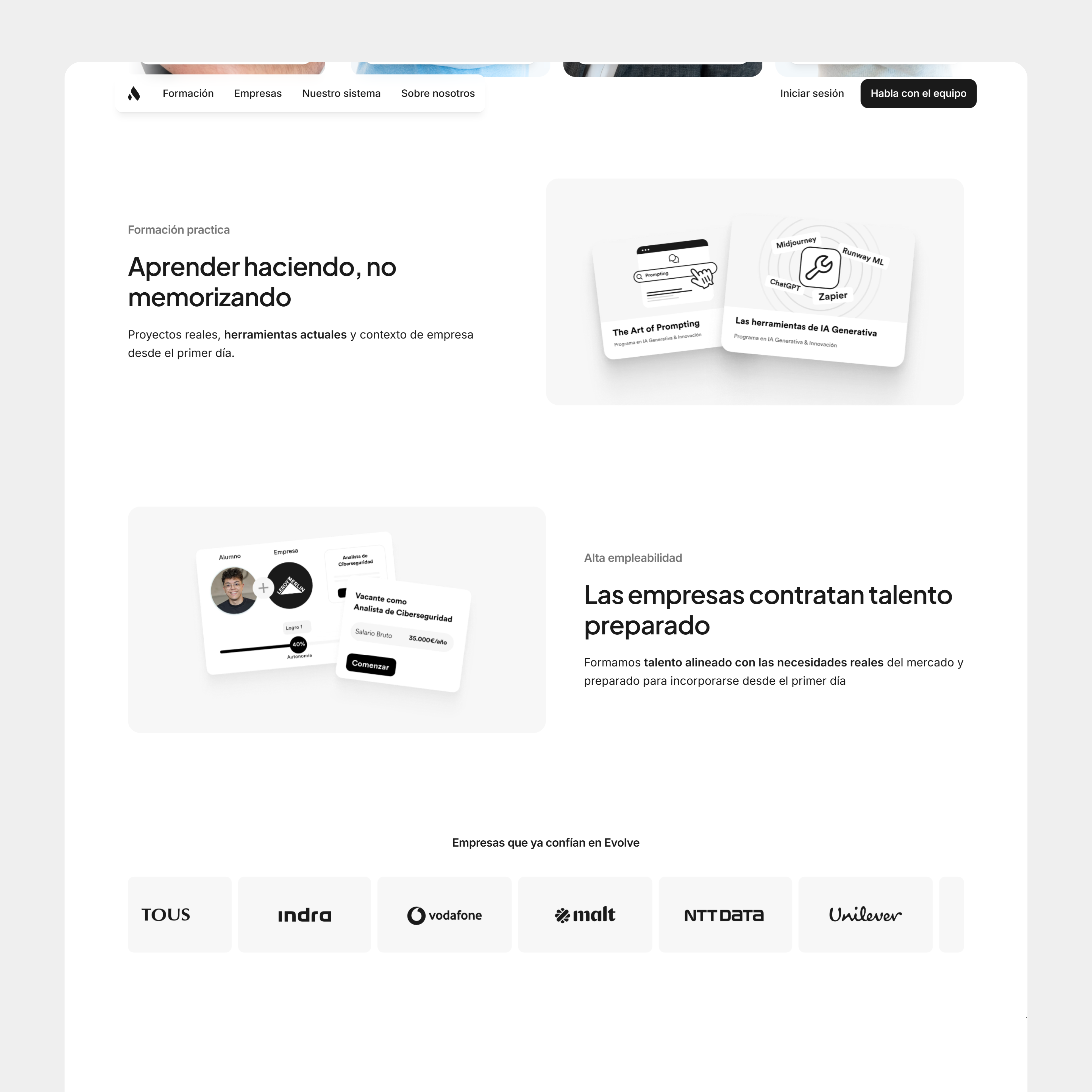
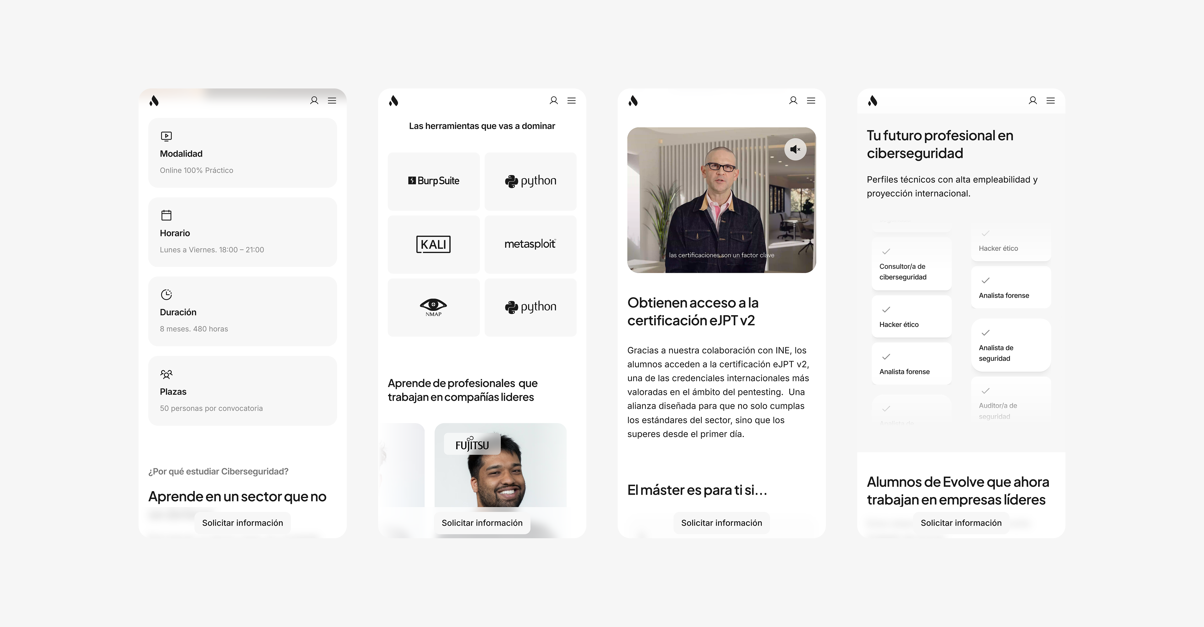
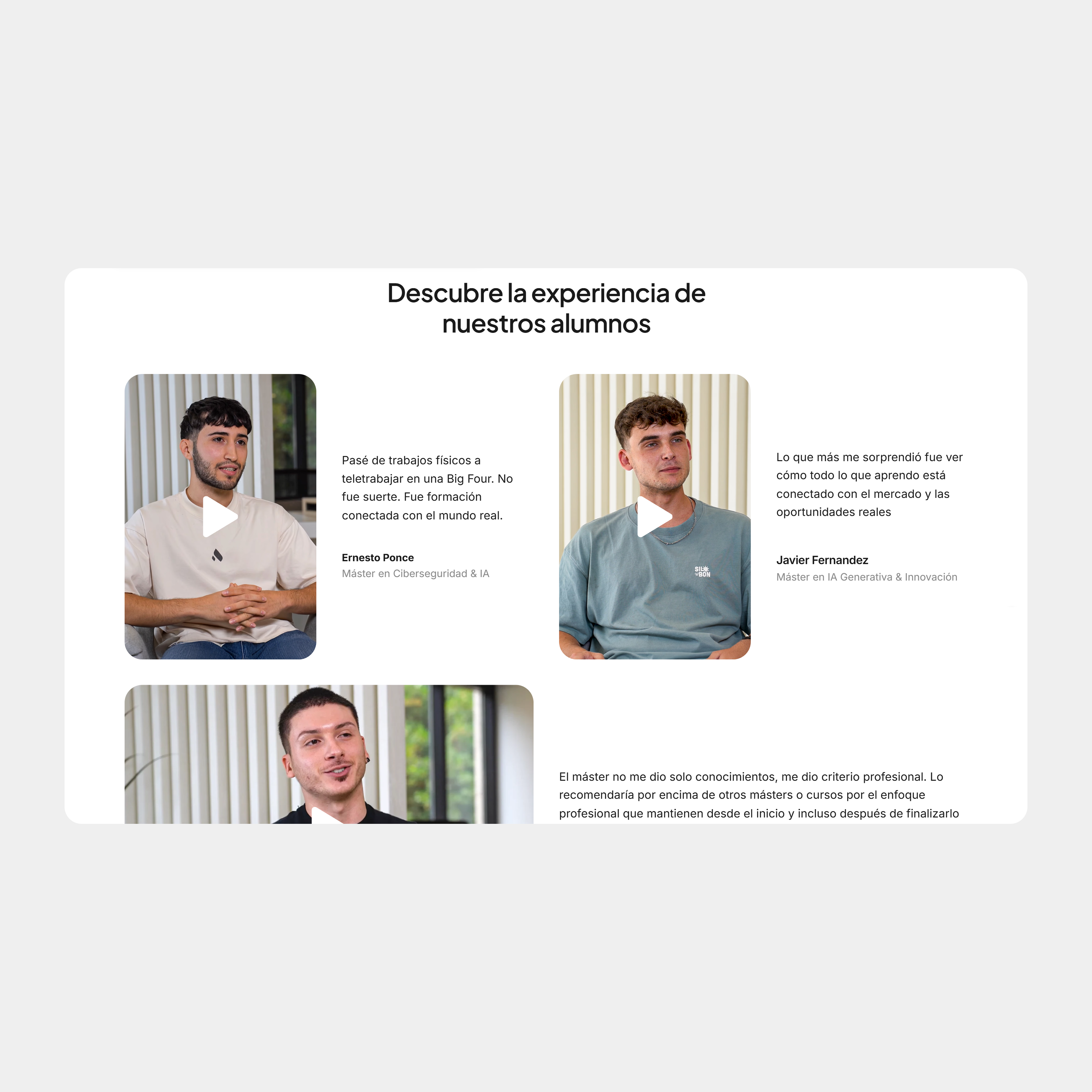
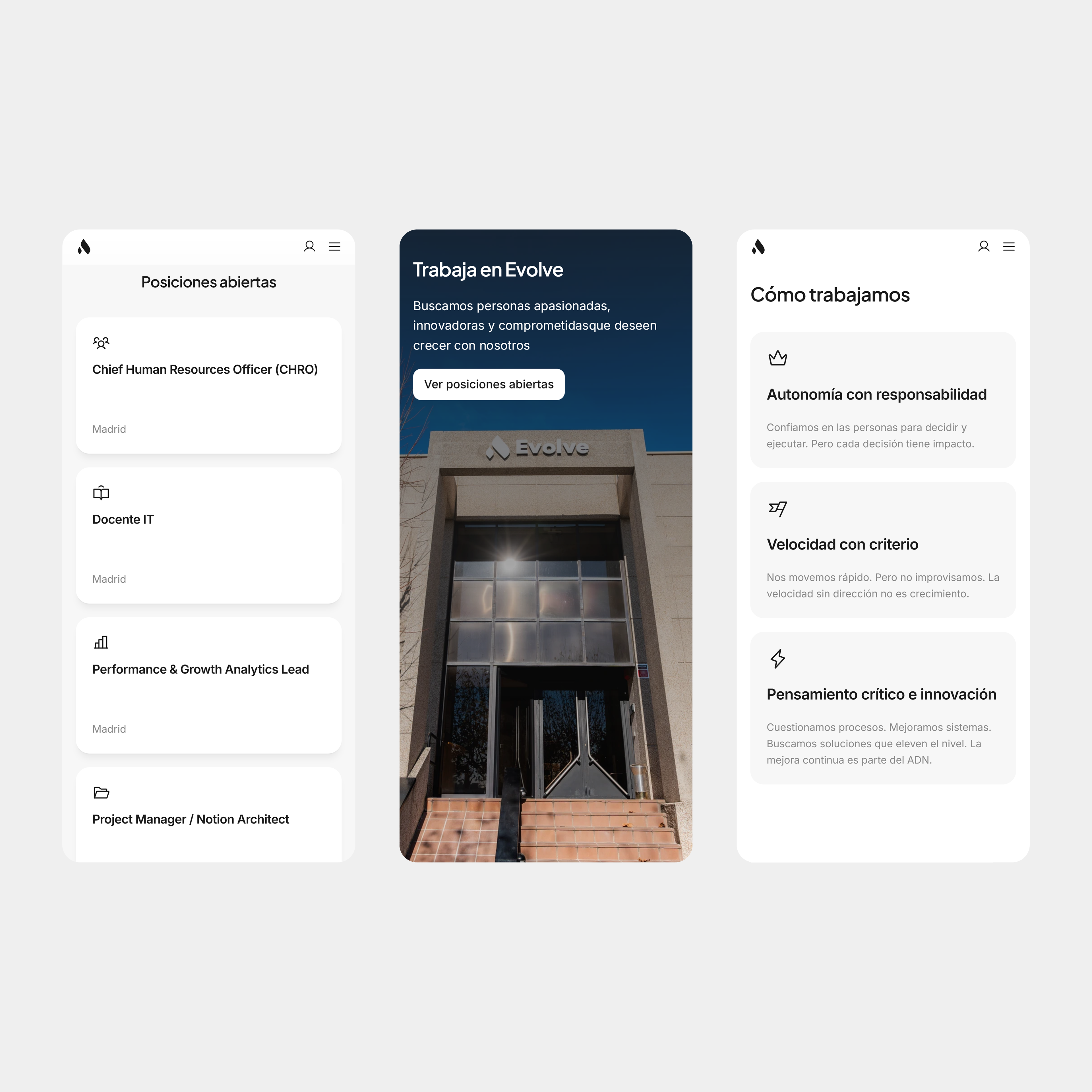
Instead of only teaching technical skills, Evolve wanted to help connect talent with real career opportunities while also helping companies access qualified profiles they struggled to find through traditional hiring channels.
The existing website no longer reflected that vision.
The challenge
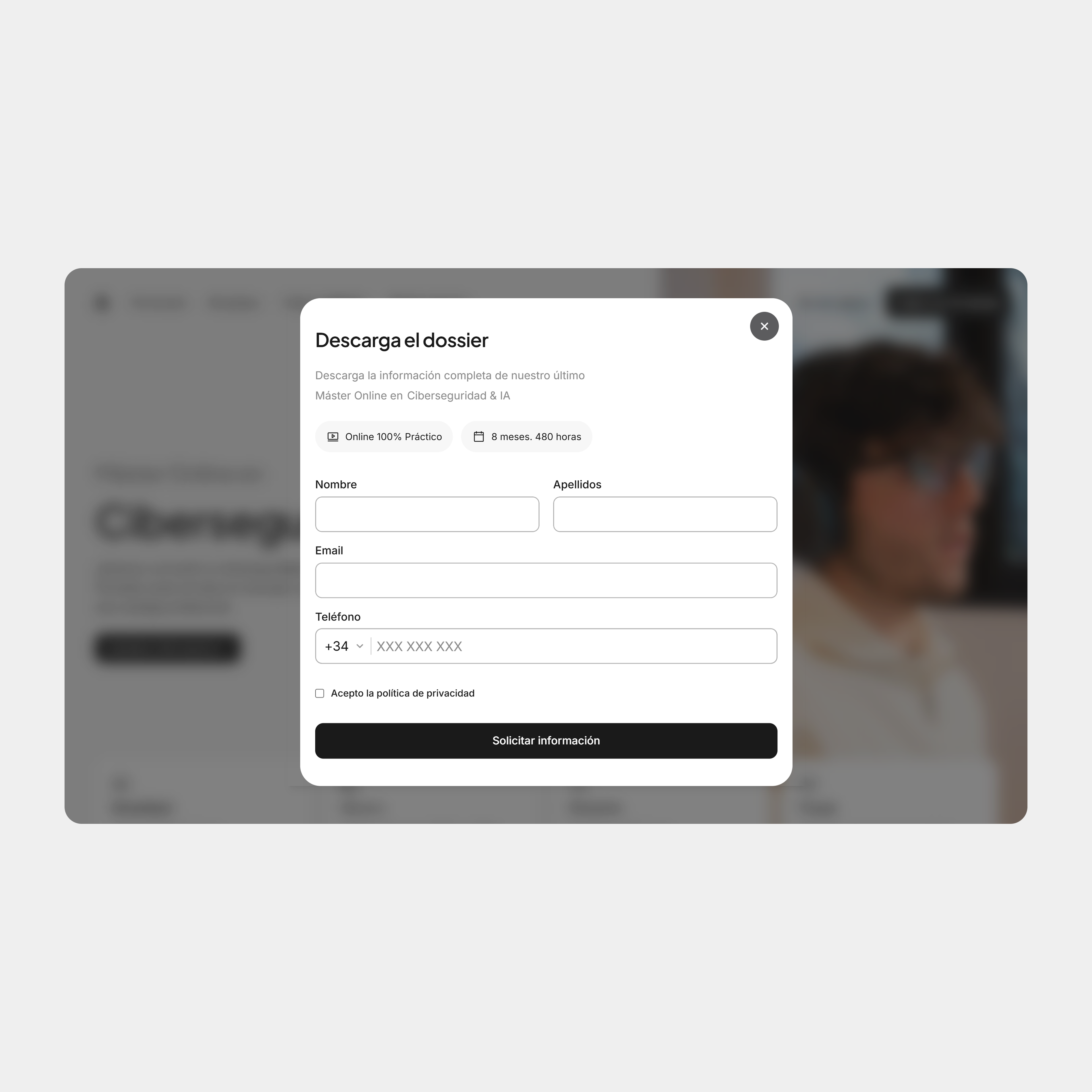
The challenge was not simply redesigning a website. The real challenge was translating a rapidly evolving business model into a digital experience that felt clear, scalable and easy to understand.
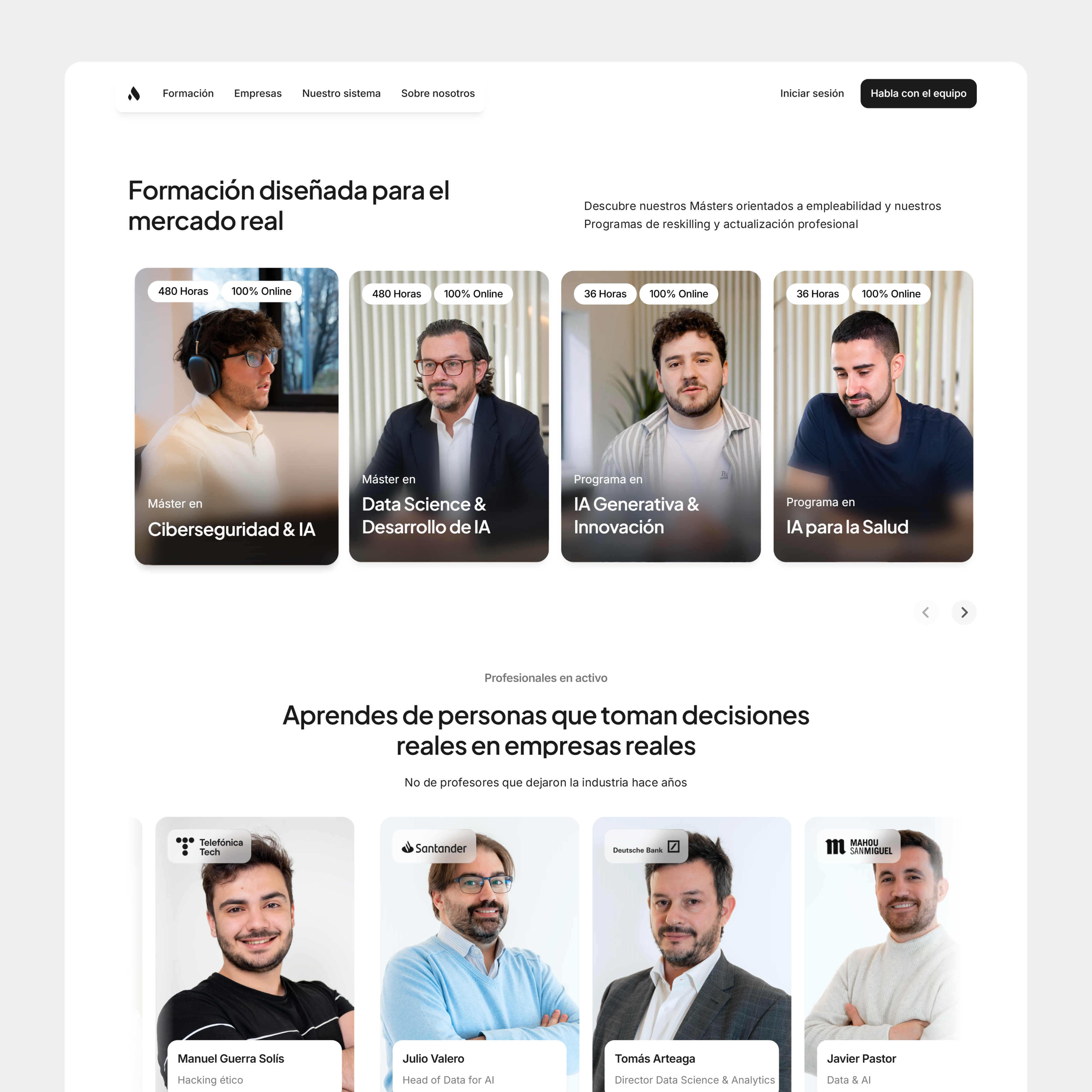
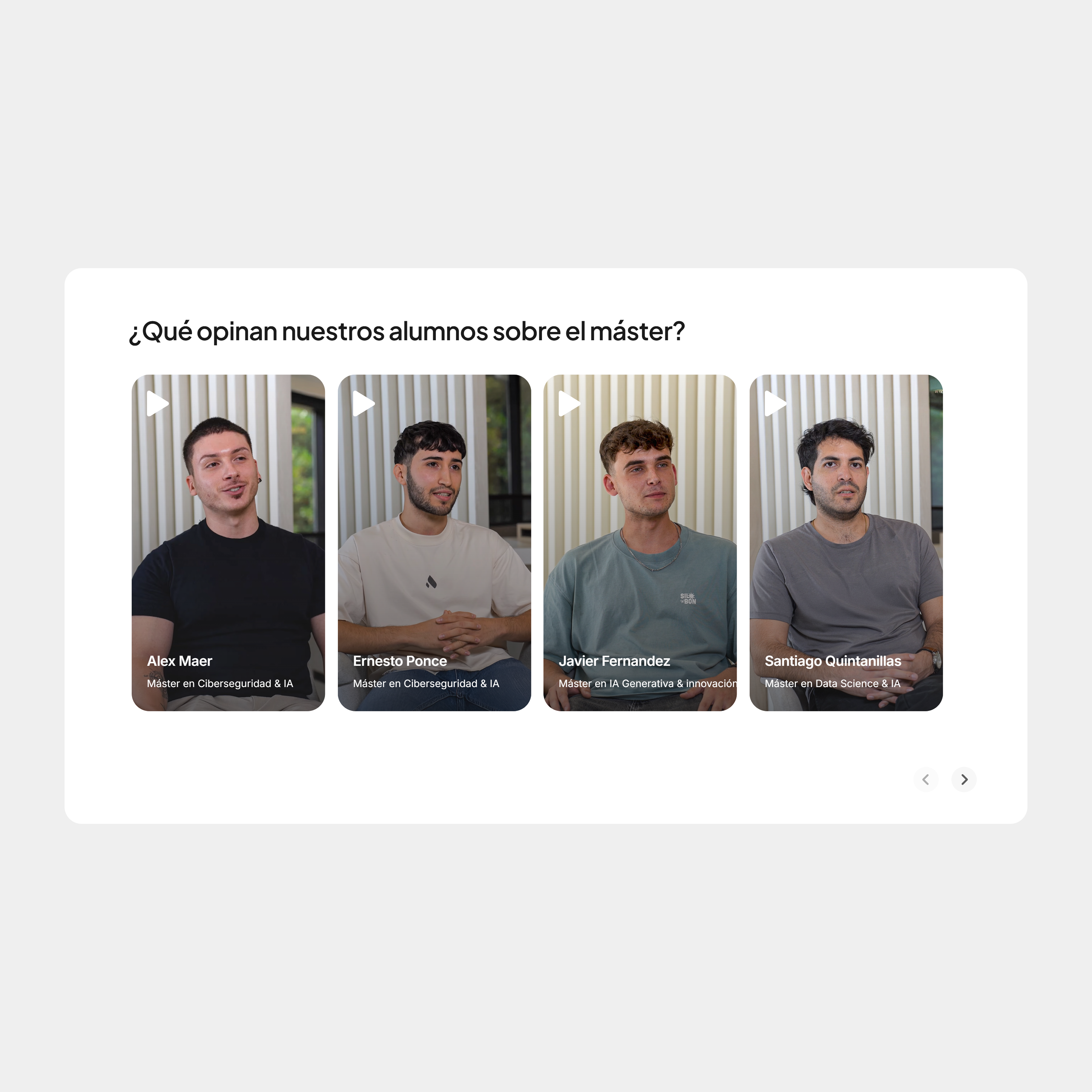
Evolve was simultaneously speaking to: students looking to enter the tech industry, professionals wanting to upskill, companies searching for qualified talent and partners and industry leaders
The platform needed to communicate all of this without feeling fragmented or overwhelming.
Working through ambiguity
One of the biggest challenges was that the company itself was evolving while the project was being built. The positioning, product structure and messaging were constantly changing as the business refined its long-term vision.
There was no fixed blueprint.
Instead of designing static pages, the process became about building a flexible digital system capable of adapting as the company grew.
This required balancing speed, clarity and scalability without overcomplicating the experience
My role
I led the visual and digital direction of the project across branding, web design and system thinking. My role went beyond creating interfaces.
I was responsible for helping translate business goals, brand positioning and product complexity into a cohesive digital experience that could scale across multiple areas of the company.
This included:
Website strategy, Information architecture, Visual direction, Responsive systems, Design systems, UI design, Motion and interaction design and collaboration across product, growth, business, and SEO teams.
Design principles
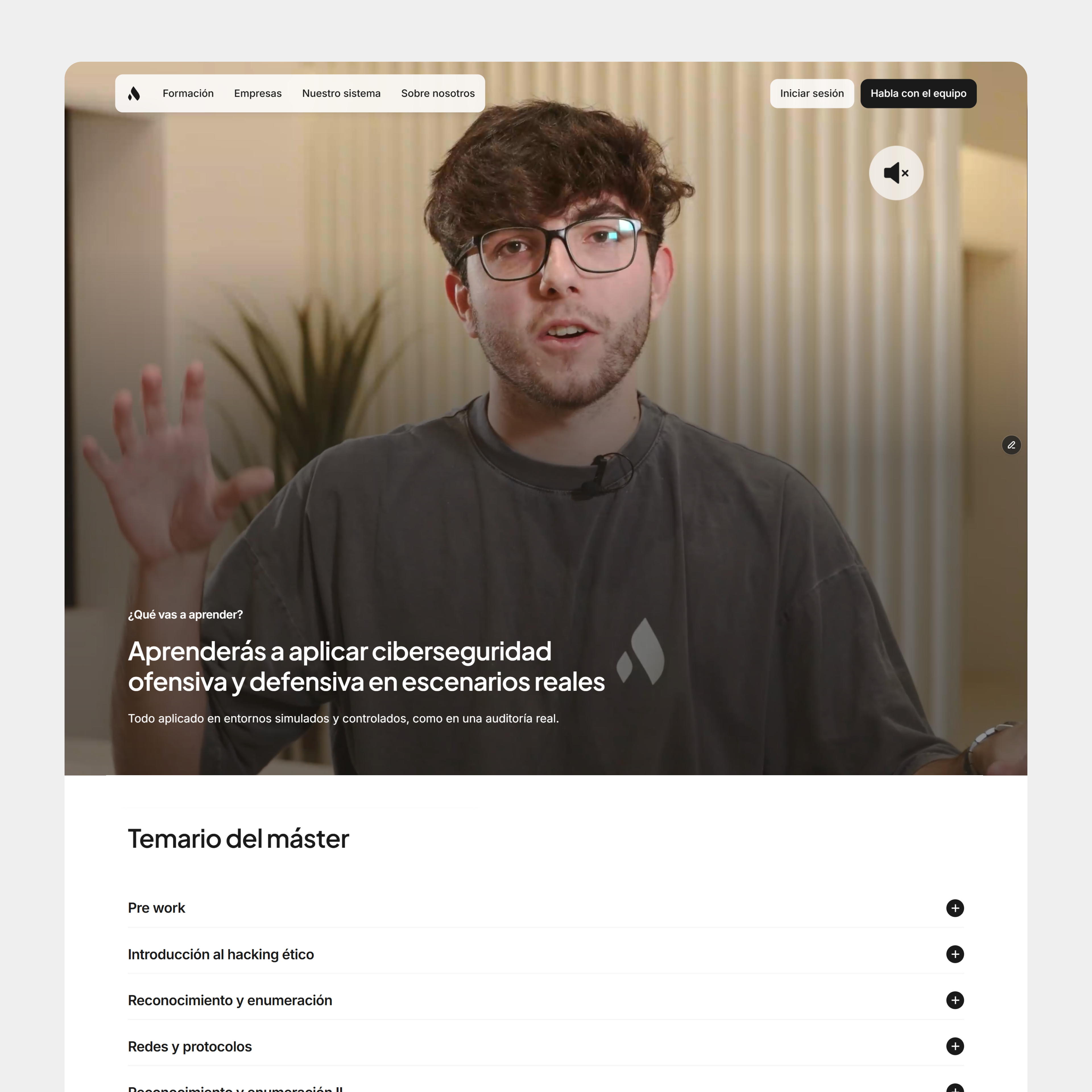
Clarity over complexity: The platform needed to communicate multiple products and audiences without overwhelming users.
Modular scalability: The system had to scale quickly as new programs, services and business areas continued to grow.
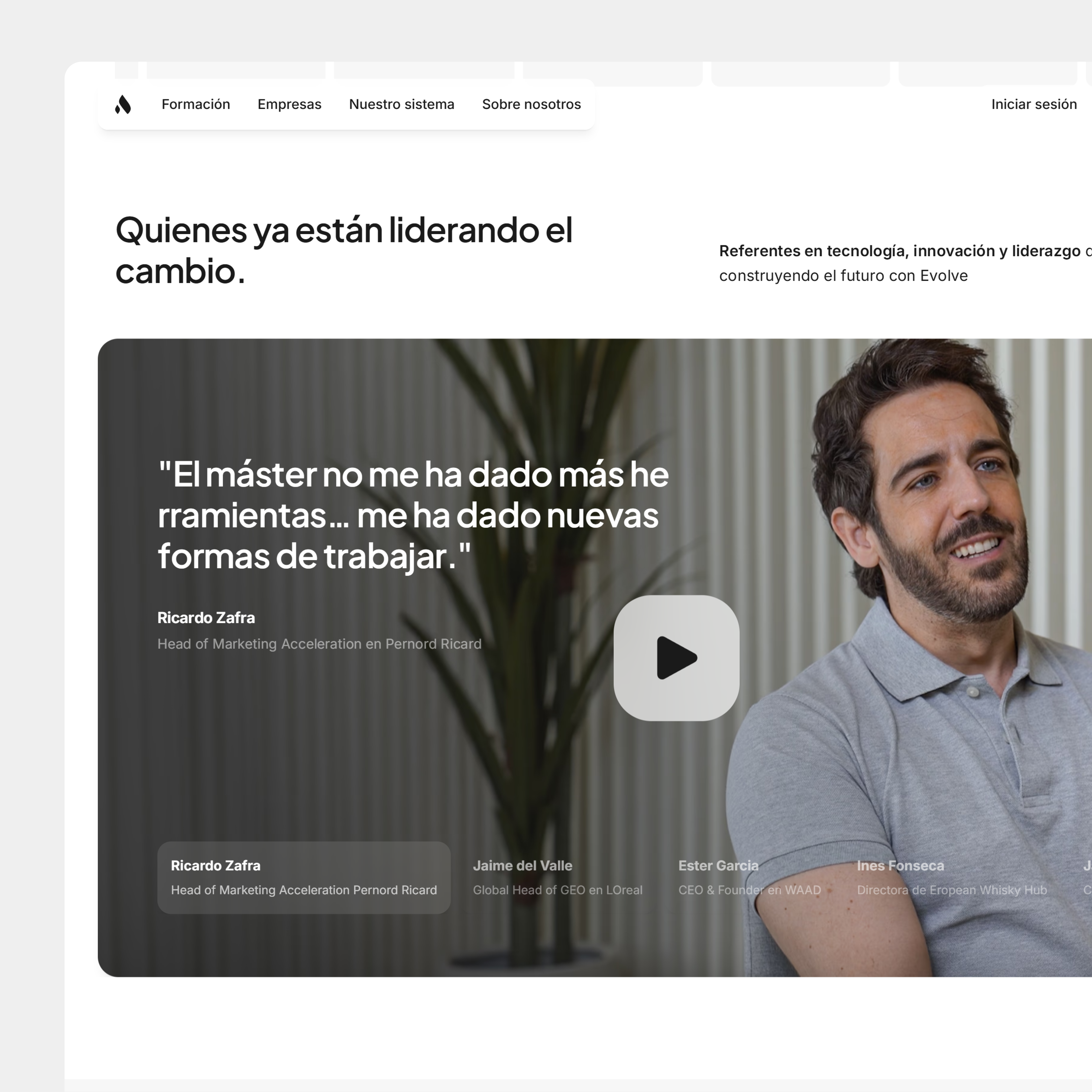
Premium but accessible: The visual direction aimed to feel modern and high-end while remaining approachable and easy to navigate.
Speed and adaptability: The experience was designed to support fast iteration without breaking consistency across the ecosystem.
Structuring the ecosystem
One of the core problems was organizing a growing ecosystem into a navigation structure that users could understand instantly.
Instead of treating every business area as isolated pages, the architecture was designed to create a connected experience between: education, talent, companies, community and partnerships.
The goal was to make the platform feel like a unified ecosystem rather than a collection of disconnected products.
Trade-offs and prioritisation
Not every idea needed to be implemented immediately. Many decisions focused on balancing visual ambition with clarity, speed and scalability.
For example, some more complex interaction concepts were intentionally simplified in order to prioritise: faster implementation, easier content management, better mobile usability and long-term flexibility.
The priority was building a system the company could evolve over time rather than creating overly rigid or visually heavy experiences.